Schools in England were spending around £75 million a year advertising roles on paid job boards. Teaching Vacancies is the free alternative.
I led the design and user experience of the service, working with a cross-functional team to keep it accessible, usable and effective. A few pieces of work that stand out are below. You can also dig into the design history for how we documented decisions in the open.
Improving how users sign in
We were getting a lot of support queries from hiring staff who were finding it hard to sign in. At the time, 24% of hiring staff sign in attempts failed because they tried to sign in as a jobseeker.
The language was ambiguous. The header “Sign in” link was clearly labelled, but it was only intended for jobseekers. “For schools”, the hiring staff login, was far less helpful. The jobseeker page was titled “Teacher sign in”, which did not help much when both groups can be teachers. Each sign in page also offered a way to log in as the other group, which added to the muddle.
We consolidated the header to a single “Sign in” link as the start of the journey for both groups. The next screen offered two clearly signposted options: sign in as a jobseeker, or sign in as hiring staff. Naming the groups and describing what each can do made it clearer who each path was for.
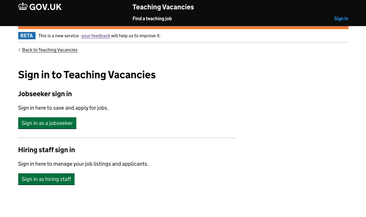
Jobseeker and hiring staff each get their own button, with a short line on what that account is for.
Jobseekers going past that screen no longer saw hiring staff references. We assumed they had picked their group and did not want more distraction on the way to logging in.
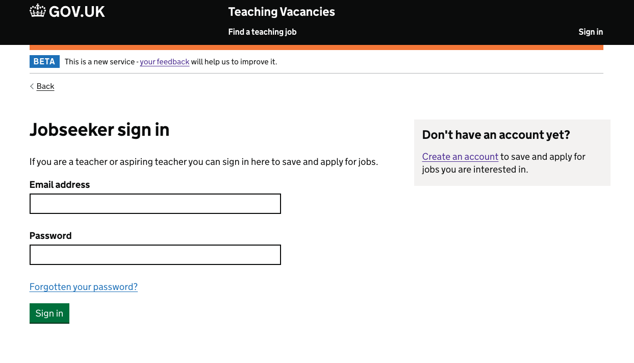
A focused funnel: email, password, and a clear route to create an account if you need one.
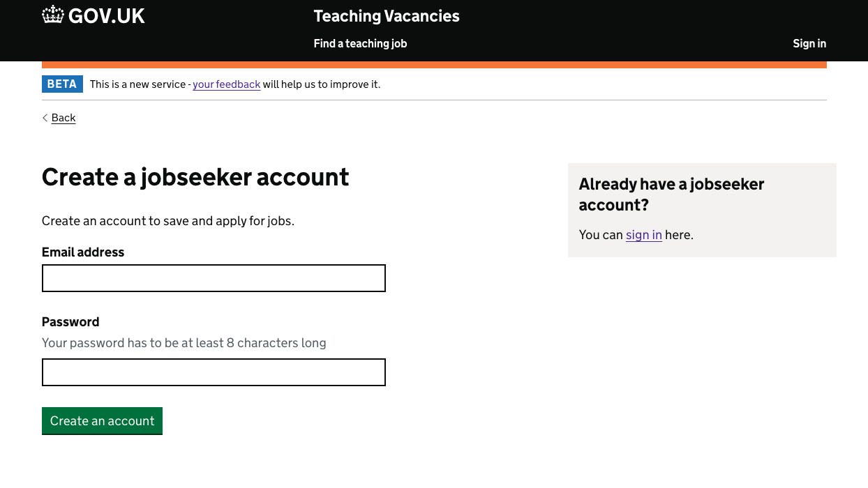
Same idea on the create account screen: keep the path simple, and offer a way back to sign in for people who already have an account.
Hiring staff also need to go through DfE Sign-in. Other teams had learned that can be disorientating, so we added a screen explaining where they were being sent before they continued.
Making filters easier to find
We wanted to understand why people were not filtering search results. Early reporting suggested almost nobody used filters. That data turned out to be wrong. For the same period, around 10% of searches already contained filtered results. Still low enough to dig into.
One hypothesis was that people could not find the filters. By default they sat inside accordions. GOV.UK guidance is clear that accordions hide content, and not everyone will notice them or understand how they work.
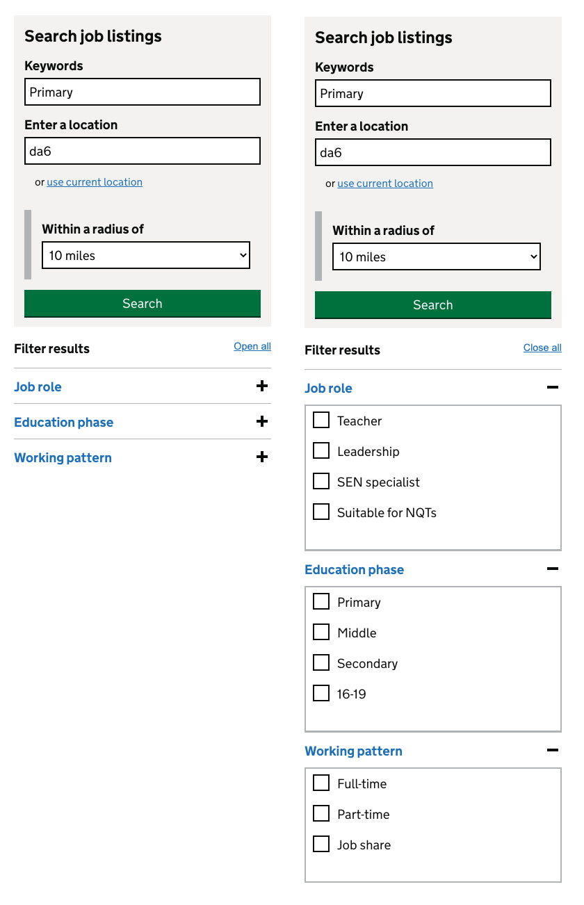
Job role, education phase and working pattern were tucked behind accordion headers. If you never opened them, you never saw the options.
We exposed the filters by default, following a pattern already used on Find postgraduate teacher training, Register trainee teachers and Manage teacher training applications. No extra click to open them, and far less chance of missing them.
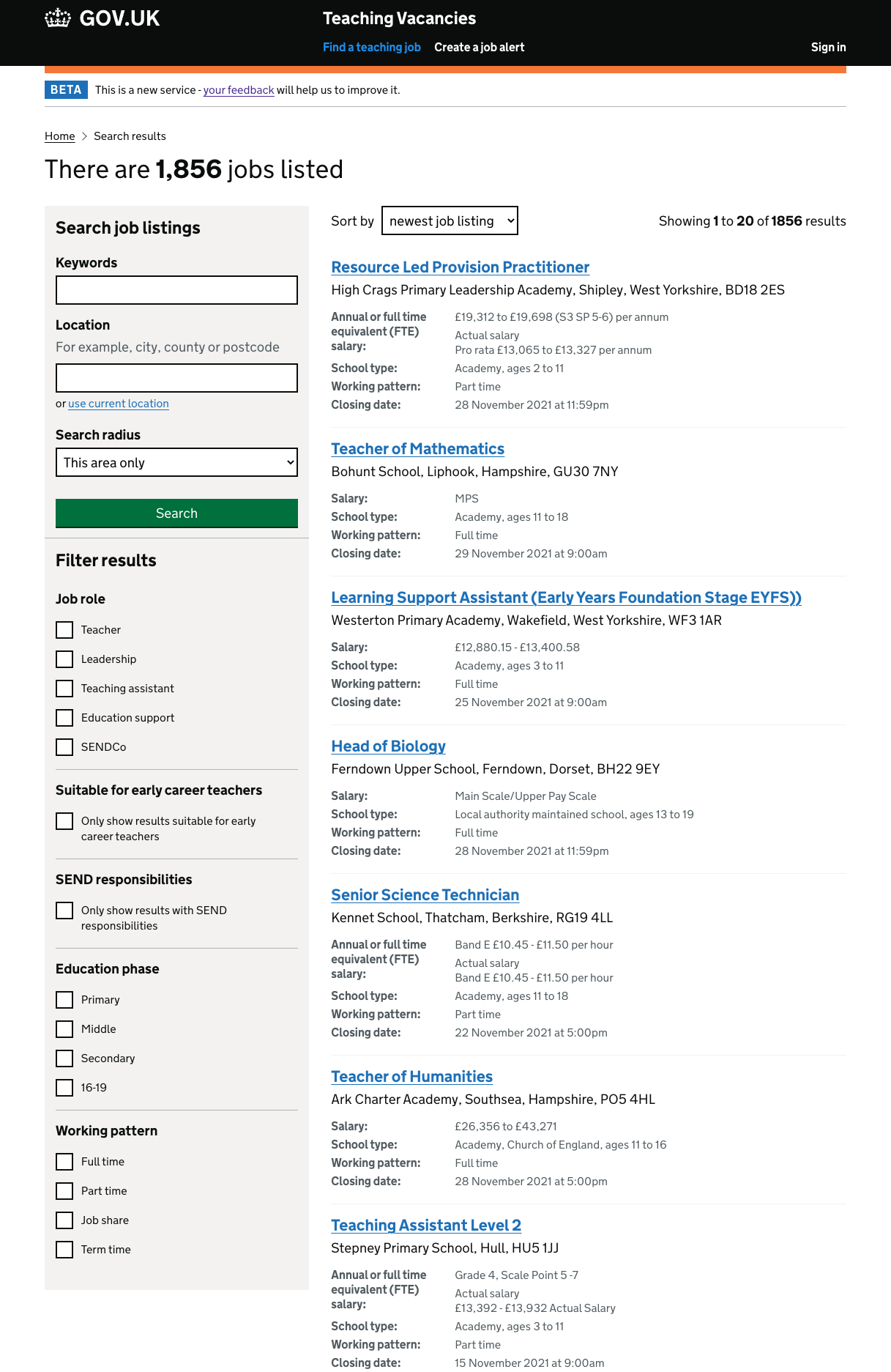
Filters stay visible alongside the listings, so refining a search no longer means hunting for a hidden control.
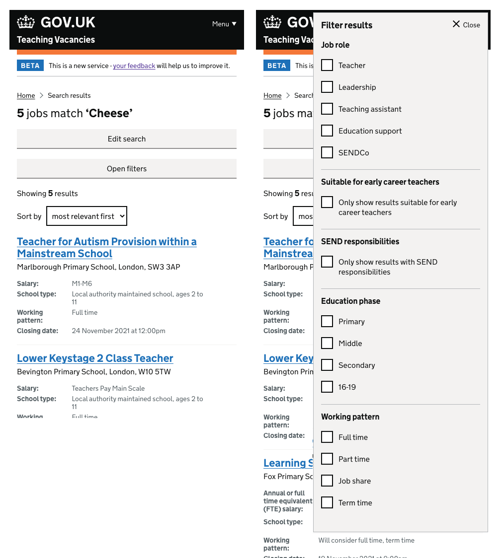
Same options, adapted for smaller screens: open filters from the results page, make a choice, close and carry on.
For a comparable later period, around 18% of searches contained filtered results. Filter use went up after the change.
We also wondered whether putting the search form above the filters encouraged people to search again instead of refining what they already had. An A/B test to decouple search from filtering was on the cards as a next step.
Redesigning the homepage
The homepage needed to do a lot for two very different audiences: people looking for a job, and hiring staff posting and managing vacancies.
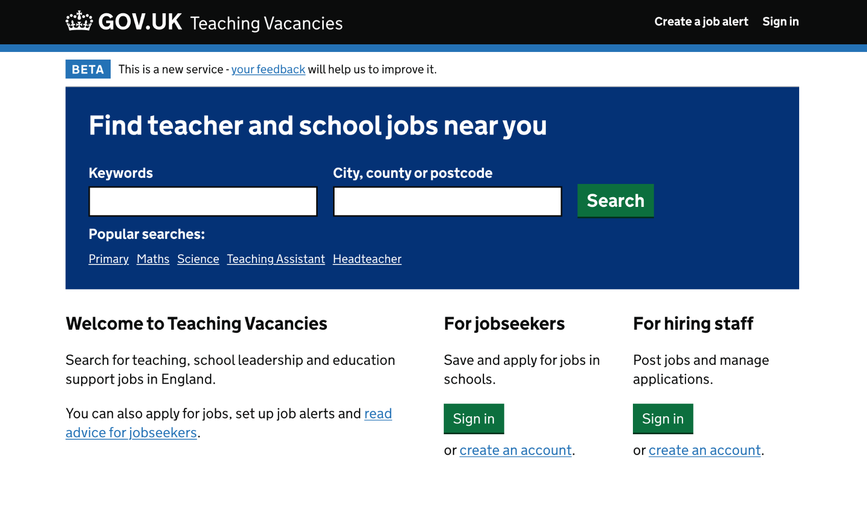
I redesigned the homepage to put search front and centre, with popular searches as shortcuts, and clearer paths into job alerts, jobseeker sign in and hiring staff sign in. Browse options for role, phase, subject and location sat below for people who prefer to explore rather than search.
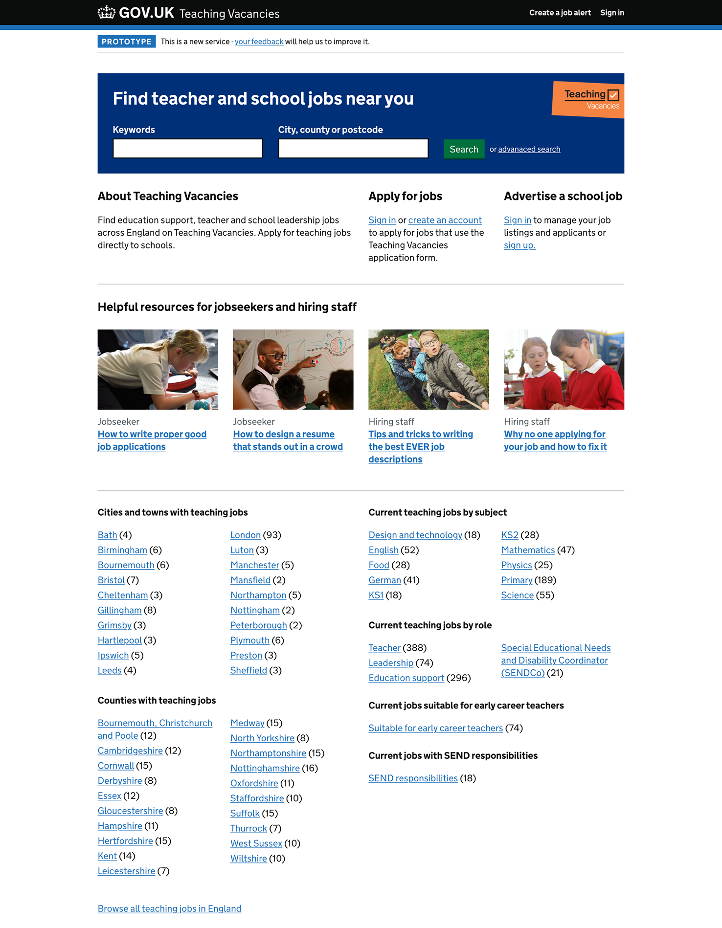
Search stays the main job. Everything else is a short path into alerts or the right kind of account.
Outcome
When I moved on from this project, we were saving schools across the UK upwards of £4M per year in advertising costs.
After exposing search filters by default, filtered searches rose from around 10% to around 18% over a comparable month.